Design Context
Blogs
CTS
Design Practice
Home
PPD
Saturday, 9 October 2010
Mash Creative
This appeals to me as the type and logo are very minimal and laid out well with against the white background. Good use of negative space. It looks organised and structured.
Tuesday, 5 October 2010
Airplane Safety Card Sequence
Chocolate bar Sequence
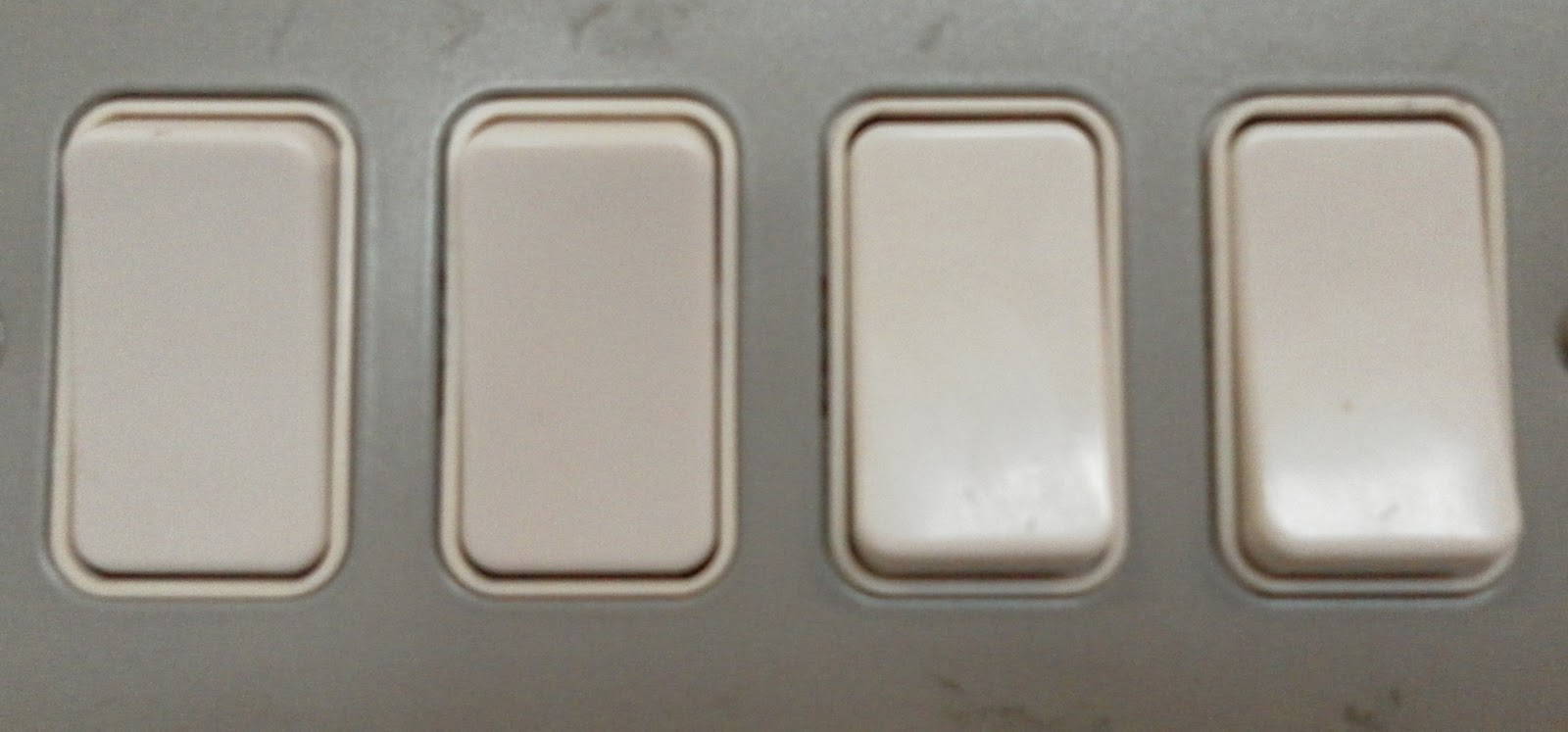
Light Switch Seqeunce
Shoes Seqeunce
Coffee Seqeunce
Coffeeeeeeeeeeeeeeee
Sunday, 3 October 2010
Toko
This is a design by Antonio Carusone, i really like the layout out and type, the white type on the black background works well.
Newer Posts
Older Posts
Home
Subscribe to:
Posts (Atom)