Showing posts with label OUGD301. Show all posts
Showing posts with label OUGD301. Show all posts
Tuesday, 11 December 2012
Joe Gilmore
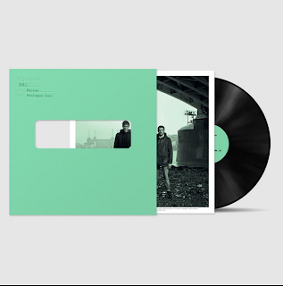
The florescents and and spot colours are really eye catching on the vynal cover. The florencent green reminds me a lot of OK200's work. I really like how the relatively thin type stands out so much when spot coloured especailly as its on such a large block of heavy image. When the type sits back on lighter area's its thin enough to still give it a block coloured effect but still be very readable. The red and black colours break a good hierarchy between secondary and primary information especially as he has only used a single weight and point-size within his typeface.
Joe Gilmore from Qubic design's project "Phthalo".
http://www.qubik.com/portfolio.php?id=2
Sunday, 2 December 2012
Context
Really like how the cover shows through to the inside cover. also all 3 pieces of final work as a good set.
Saturday, 1 December 2012
Friday, 30 November 2012
Filthy Media
Some context from filthy media, a design studio I have been following for a couple of years now. I like the simplicity within their logo's and design.
Sunday, 25 November 2012
Julie Brandt
http://www.behance.net/gallery/JULIE-BRANDT-AW12/4414219
Some lookbook context, really good image heavy layout. very plain and minimal, the focus is all on the images.
Subscribe to:
Posts (Atom)


