
A example of a range of products all relating to a sport, this kind of gives me an idea of how to apply my design across a series of products


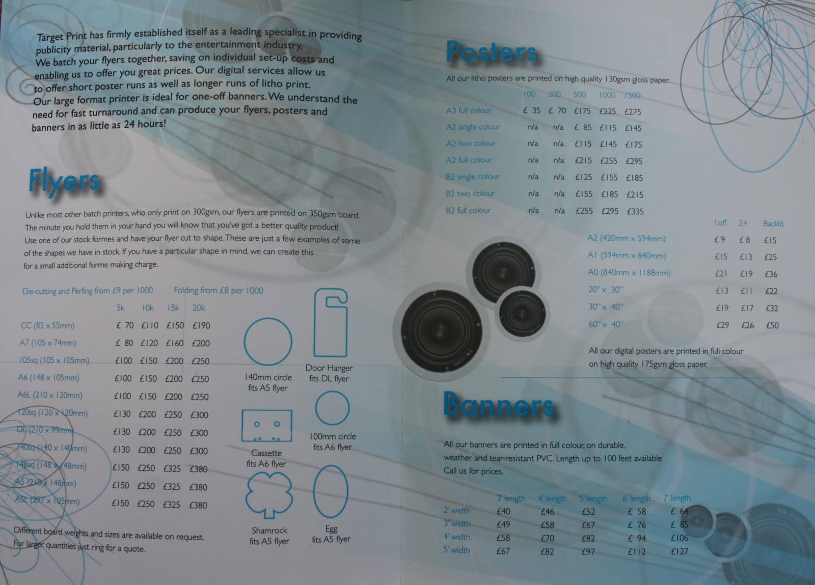
Event Posters
Waterproof and tear-resistant - ideal for outdoor use.
For pubs, clubs, concerts, venues, sales promotions, window displays, bus shelters and so on.
720 dpi photo quality printing, single-sided onto matte white synthetic paper.
| |||
| Quantity | A3 | A2 | A1 |
| 1 to 5 copies | £4.99 each | £8.99 each | £15.99 each |
| 6 to 10 copies | £4.49 each | £8.09 each | £14.39 each |
| 11 and over | £4.04 each | £7.28 each | £12.95 each |
A6Sheet Size148mm 105mm
Printed full colour litho onto 135gsm gloss paper
| |||
Printed full colour litho onto 135gsm gloss paper
| |||
| Quantity | Full colour one side | Plus black on reverse | Full colour both sides |
| 250 | £26 | £36 | £36 |
| 500 | £28 | £38 | £38 |
| 1,000 | £31 | £42 | £42 |
| 2,500 | £41 | £53 | £53 |
| 5,000 | £55 | £68 | £68 |
| 7,500 | £65 | £80 | £80 |
| 10,000 | £78 | £95 | £95 |


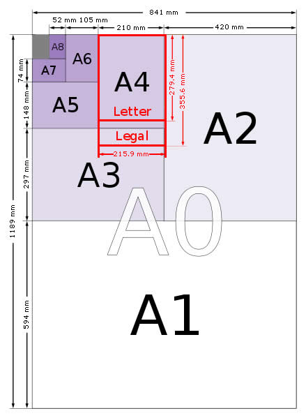
| Size | Height x Width (mm) | Height x Width (in) |
| 4A0 | 2378 x 1682 mm | 93.6 x 66.2 in |
| 2A0 | 1682 x 1189 mm | 66.2 x 46.8 in |
| A0 | 1189 x 841 mm | 46.8 x 33.1 in |
| A1 | 841 x 594 mm | 33.1 x 23.4 in |
| A2 | 594 x 420 mm | 23.4 x 16.5 in |
| A3 | 420 x 297 mm | 16.5 x 11.7 in |
| A4 | 297 x 210 mm | 11.7 x 8.3 in |
| A5 | 210 x 148 mm | 8.3 x 5.8 in |
| A6 | 148 x 105 mm | 5.8 x 4.1 in |
| A7 | 105 x 74 mm | 4.1 x. 2.9 in |
| A8 | 74 x 52 mm | 2.9 x 2.0 in |
| A9 | 52 x 37 mm | 2.0 x 1.5 in |
| A10 | 37 x 26 mm | 1.5 x 1.0 in |
| Size | Height x Width (mm) | Height x Width (in) |
| B0 | 1414 x 1000 mm | 55.7 x 39.4 in |
| B1 | 1000 x 707 mm | 39.4 x 27.8 in |
| B2 | 707 x 500 mm | 27.8 x 19.7 in |
| B3 | 500 x 353 mm | 19.7 x 13.9 in |
| B4 | 353 x 250 mm | 13.9 x 9.8 in |
| B5 | 250 x 176 mm | 9.8 x 6.9 in |
| B6 | 176 x 125 mm | 6.9 x 4.9 in |
| B7 | 125 x 88 mm | 4.9 x. 3.5 in |
| B8 | 88 x 62 mm | 3.5 x 2.4 in |
| B9 | 62 x 44 mm | 2.4 x 1.7 in |
| B10 | 44 x 31 mm | 1.7 x 1.2 in |
| Size | Height x Width (mm) | Height x Width (in) |
| C0 | 1297 x 917 mm | 51.5 x 36.1 in |
| C1 | 917 x 648 mm | 36.1 x 25.5 in |
| C2 | 648 x 458 mm | 25.5 x 18.0 in |
| C3 | 458 x 324 mm | 18.0 x 12.8 in |
| C4 | 324 x 229 mm | 12.8 x 9.0 in |
| C5 | 229 x 162 mm | 9.0 x 6.4 in |
| C6 | 162 x 114 mm | 6.4 x 4.5 in |
| C7 | 114 x 81 mm | 4.5 x. 3.2 in |
| C8 | 81 x 57 mm | 3.2 x 2.2 in |
| C9 | 57 x 40 mm | 2.2 x 1.6 in |
| C10 | 40 x 28 mm | 1.6 x 1.1 in |
| Size | Width x Height (mm) | Width x Height (in) | Aspect Ratio | Nearest ISO |
| A | 216 x 279 mm | 8.5 x 11.0 in | 1:1.2941 | A4 |
| B | 279 x 432 mm | 11.0 x 17.0 in | 1:1.5455 | A3 |
| C | 432 x 559 mm | 17.0 x 22.0 in | 1:1.2941 | A2 |
| D | 559 x 864 mm | 22.0 x 34.0 in | 1:1.5455 | A1 |
| E | 864 x 1118 mm | 34.0 x 44.0 in | 1:1.2941 | A0 |