Wednesday, 25 May 2011
What is Graphic Design: Image
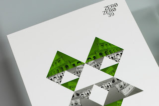
A graphic identity for an italien restaurent done by a design agency called Toormix based in barcelona
What is Graphic Design: Type
This is an identity done by Sam Chirnside for Anna Lunoe an Australian ministry of sound signed DJ. By just looking at the typeface you can get a feel for what the dj's music would be like.
What is Graphic Design: Image
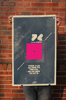
These are posters and logos done for a Free Will Society Jazz band and lounge by Mihail Mihaylov.
This works well as a poster it has a type on it but its mainly image driven, the problem is i dont know what im looking at besides nice shapes. If i knew what this poster represented before reading about it i would spot it on a wall easily, its shapes and colour is very recognizable and unique.
These would work much better as a website, the black and white image with the coloured tabs draws my attention immediately. But not as a logo or a poster.
What is Graphic Design: Type
This is a brand identity done for a company, the designer is Roger Oddone. I like the simplicity of it, again it just gives the information we need on the cards and nothing more.
What is Graphic Design: Image
This a image driven advert for Playstation 3 by Kopyov, his work is mainly digitally driven. A lot of his work im not too keen on but this advert really worked for me. In my view it grasps its audience very well and doesn't need any type to go with it. It gives the idea that PS3 is magical and has no limitation. The audience for this advert will mainly be teenagers as well and this type of design is especially appealing for them.
Tuesday, 24 May 2011
What is Graphic Design: Type & Image
Sofia Architecture week by post studio
Posters advertising sofia architecture week.. The posters instantly attract attention and they convey their content clearly, perfect for advertising information for a exhibition. I like how the images on the poster has been cut up to break up the large photo, it balances the information on the poster and stops the image over powering the text. The opaque red text over the image works really well it makes a good focal point against the black and white image.
Lust
Came across this while looking for stuff to put on for what is graphic design, dont think it fits in the catagories but i really like the colour and stocks used in the magazine. The layout is really minmal as well and its main focus is the image. The stock and the images colours work really well together, i always find it really hard to get my images to sit well on light stock, but this has given me some ideas of how to get the image and paper to blend a bit better and not leave really harsh edges.
What is Graphic Design: Type
Phong Phan
The design is so simple and minimal, it works really well with the negative spacing as well. In my view its a pretty good business card as its got just the basics on nothing to distract you from what you need to know.
What is Graphic Design: Type & Image
Dustin Chessin
My new favourite designer... his use of photography and text is so simple and effective. The shapes and type he has added to the images doesn't ruin them it just gives it a different focal point. This type of design can have various audiences depending on the content.
I have always been interested in photography along side my graphic design but never really know how to link the two together very well, seeing this has helped.
What is Graphic Design: Type
Dustin Chessin
These are all a set of type driven logo's made with the names and lyrics of famous hip hop artists. The audience for this can be anyone who's interested in the type of music. The type logo's sit really well together if you glance at it, there never too structured either. By just dropping out parts of the letters and extending others his managed to make really simple and good logo's.
Subscribe to:
Comments (Atom)


