Tuesday, 11 December 2012
Joe Gilmore
The florescents and and spot colours are really eye catching on the vynal cover. The florencent green reminds me a lot of OK200's work. I really like how the relatively thin type stands out so much when spot coloured especailly as its on such a large block of heavy image. When the type sits back on lighter area's its thin enough to still give it a block coloured effect but still be very readable. The red and black colours break a good hierarchy between secondary and primary information especially as he has only used a single weight and point-size within his typeface.
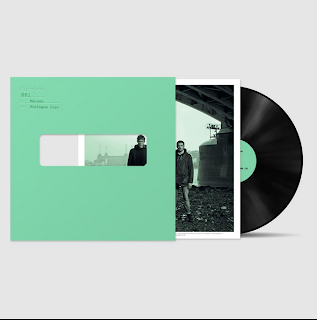
Joe Gilmore from Qubic design's project "Phthalo".
http://www.qubik.com/portfolio.php?id=2
Sunday, 2 December 2012
Context
Really like how the cover shows through to the inside cover. also all 3 pieces of final work as a good set.
Saturday, 1 December 2012
Subscribe to:
Comments (Atom)


