Monday, 28 February 2011
opposites brief
I like the way this book contrast's colour and illustrates the concept of "opposites" using black, white and shades of grey.
Wednesday, 16 February 2011
Design for Screen
Webdesign.go
This is a french design company website. I think this is a great idea for a website. The photography aspect makes up the background and it also shows something about the designers personality. The colour scheme works really well and the website makes you want to interact with it. The layout of the photographs and the text works really well.
Design for Screen
Peter Penmintel - Design can Change
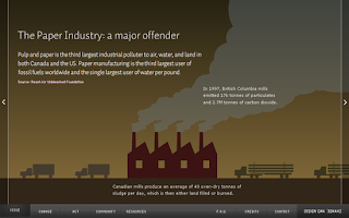
This is a interactive website for climate change, i liked how he used info graphics to relay all the statistics he had to the public, this makes the website much easyer to understand. The info graphics are very simple and easily understood. The colour scheme is also appropriate.
Design for screen
This type of web design i really like as the light grey background breaks up that "harsh" contrast usaully found between black text and white background. The columns also breaks up the information given into smaller bits broken up by images, this just makes a lot of information seem easier to follow. The websites layout and image is really good for the amount of information its relaying, the colour scheme also fits really well.
Design for screen
This is an interactive website where you can design your own character, i like this websites colour scheme it feels authentic and welcoming. The illustrations on the website are also very simple and interactive. The website makes you want to interact with it and create a character.
Design for Screen
The illustrations and type worked very well in this video to send a friendly message, i liked this video because of the style its been done in. It also gives a lot of information in a simple way for the viewer to easily understand. I really like the simplicity of the illustrations and text.
Monday, 14 February 2011
Design for screen
Orange Brand Video created by Karolina Kret
I really like this advert from orange like most of the work their designers produce, would love to get involved in one of their projects. The video breaks down many complicated factors they had to show their customers into a short engaging video.
Design for screen
This is a really creative video its done by d. kele for what i assume is a free boarding advert.
Design for screen
These are some screenshots from a video which was made for "little bites" by lisa machima. I really liked the info graphics style the video was done in.
Design for screen
This is a campaign for energie in motion, what drew me to these images is the use of photography and light, i would like to attempt to do simular projects if i have a brief which allows it or enough spare time, i have always been interested in this type of work and possibly producing it in a stopmotion form.
Wednesday, 9 February 2011
Statistical data collected on hair colour
At first i collected really simple data i could set into mock up graphs. This data was purely just how many people out of a hundred had Black, Brown, Auburn, Blonde or another hair colour. This gave me an idea what the general trend is in popular hair colour.
After making some interesting mock up graphs i decided to go into more depth and used a set of pantone matching swatches to get more accurate results i decided to categorise the hair i was surveying into colour, pantone, type of hair, sex and length incase i needed any other addition information down the line. This is my results from surveying a 100 people.
Subscribe to:
Comments (Atom)


